Pricing Model
Streamkap uses a volume-based pricing model:- Charged based on: GB of data using the maximum of inbound (sources) and outbound (destinations)
- Billing metric: Maximum of inbound and outbound data
- Volume discounts: Available for larger consumption tiers
When migrating from a Monthly Active Rows model to a per-GB model, use an approximate conversion rate of 5 million rows per GB.
Usage Overview
The Usage page displays usage data across three key metrics: Billable Data, Inbound Data, and Outbound Data.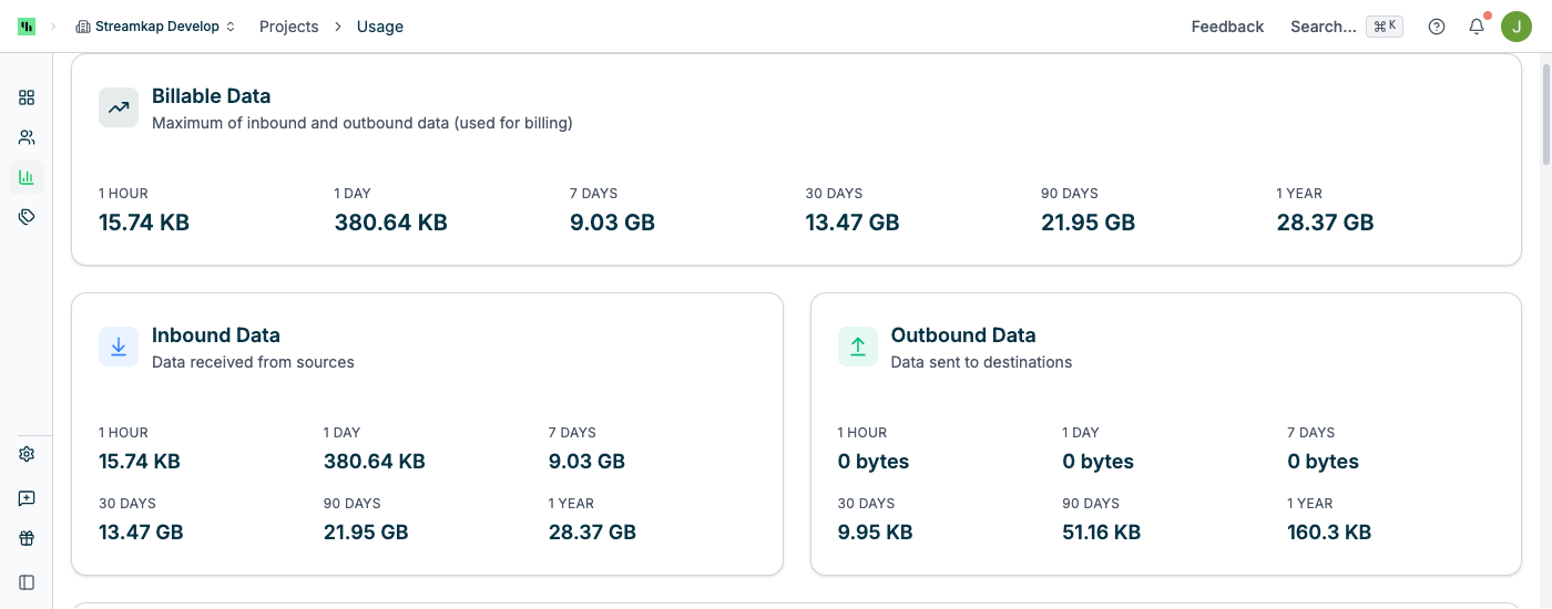
Billable Data
The primary billing metric represents the maximum of inbound and outbound data for each time period:- 1 HOUR: Real-time usage in the past hour
- 1 DAY: Total usage in the past 24 hours
- 7 DAYS: Weekly usage accumulation
- 30 DAYS: Monthly usage (common billing cycle)
- 90 DAYS: Quarterly usage trends
- 365 DAYS: Annual usage for long-term planning
Billable Data = MAX(Inbound Data, Outbound Data) for each time period.
Inbound Data
Tracks data read from source connectors into Streamkap Kafka topics:- Measures raw data ingested from databases (MySQL, PostgreSQL, DynamoDB, etc.)
- Includes change data capture (CDC) events and initial snapshots
- Source of truth for data entering your Streamkap project
Outbound Data
Tracks data written from Kafka topics to destination connectors:- Measures data delivered to data warehouses and lakes
- Includes writes to BigQuery, Snowflake, ClickHouse, Databricks, etc.
- May differ from inbound if using filtering, transformations, or partial replication
Outbound data can be lower than inbound if you filter data before writing to destinations, or higher if you replicate the same source data to multiple destinations.
Usage Over Time
The interactive time series chart visualizes data flow over time: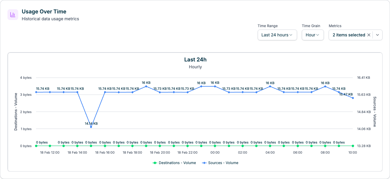
- Time Range Selector: Last 24 hours, Last 7 days, Last 30 days
- Metric Toggle: Select which metrics to display (Destinations - Volume, Sources - Volume)
- Hover Tooltips: View exact values at specific time points
- Data Granularity: Hourly for 24h view, daily for longer periods
- Legend: Click legend items to show/hide metric lines
- Identify usage spikes and patterns
- Correlate usage with business events
- Plan capacity and budget based on trends
- Detect anomalies or unexpected data volumes
Connector Usage Tables
Track usage per individual connector with detailed breakdowns.Sources - Inbound
Lists all source connectors with their inbound data usage: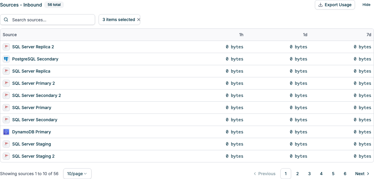
- Source Connector: Connector name with icon (click to navigate to connector detail)
- 1 Hour: Data ingested in the past hour
- 1 Day: Data ingested in the past 24 hours
- 7 Days: Weekly ingestion volume
- Additional time ranges available via column selector
- Search: Filter sources by name
- Export Usage: Download usage data as CSV for reporting
- Column Selector: Choose which time periods to display (1 Hour, 1 Day, 7 Days, 30 Days, 90 Days, 365 Days)
- Show/Hide Table: Toggle table visibility with checkbox
- Pagination: Navigate through large connector lists
- Click column headers to sort by usage in that time period
- Identify highest-consuming sources quickly
Destinations - Outbound
Lists all destination connectors with their outbound data usage: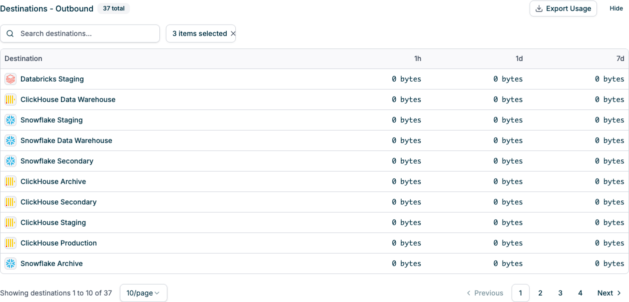
- Destination Connector: Connector name with icon (click to navigate to connector detail)
- 1 Hour: Data written in the past hour
- 1 Day: Data written in the past 24 hours
- 7 Days: Weekly write volume
- Additional time ranges available via column selector
- Same search, export, column selector, and pagination capabilities as Sources table
- Helps identify destinations consuming the most bandwidth
- Useful for optimizing replication strategy
Understanding Your Bill
How Billing is Calculated
- Measure Period: Typically 30 days (monthly billing cycle)
- Calculate Billable Data: MAX(Inbound Data, Outbound Data) for the period
- Apply Pricing Tier: Based on total volume and any volume discounts
- Generate Invoice: Charges based on actual consumption
Example Calculation
If in a 30-day period you have:- Inbound Data: 125.5 GB
- Outbound Data: 148.3 GB
Cost Optimization Strategies
- Filter Early: Use table/column filters in source connectors to reduce inbound volume
- Optimize Replication: Only replicate to destinations that need the data
- Use Transforms: Apply data transformations to reduce payload sizes
- Monitor Trends: Watch the metrics chart for unexpected spikes
- Review Per-Connector: Identify high-volume connectors and optimize their configuration
- Compress Data: Use compression settings where available
- Schedule Snapshots: Run full snapshots during off-peak times if possible
Best Practices
- Set Up Alerts: Monitor usage thresholds and get notified of spikes (see Alerts)
- Regular Exports: Download connector usage reports monthly for record-keeping
- Optimize Sources: Start with source-side filtering to reduce overall data movement
- Review Inactive Connectors: Pause or delete connectors that aren’t actively used
- Test in Non-Production: Use separate projects for testing to avoid unexpected charges
- Understand Your Data: Know which tables/topics generate the most volume
- Plan for Growth: Use historical data to forecast usage as your business scales
- Leverage Volume Discounts: Contact sales if you’re approaching higher usage tiers
Troubleshooting
Usage Doesn’t Match Expectations
If usage numbers seem incorrect:- Check Time Zone: Usage metrics use UTC timestamps
- Verify Connectors: Ensure all connectors are accounted for
- Review Recent Changes: Check if new sources/destinations were added
- Inspect High-Volume Sources: Sort connector tables by usage to find outliers
- Check for Snapshots: Full table snapshots can cause large usage spikes
- Review Logs: Check connector logs for unusual activity (Logs)
Unexpected Billing Spike
If you see a sudden increase in usage:- Check Metrics Chart: Identify exactly when the spike occurred
- Review Connector Tables: Find which connector(s) caused the spike
- Inspect Connector Logs: Look for error patterns or configuration changes
- Verify Data Sources: Check if source databases had bulk inserts or updates
- Contact Support: Reach out to Streamkap support for billing questions
Zero Usage Showing
If connectors show 0 bytes but should have data:- Check Connector Status: Ensure connectors are running (Pipelines)
- Verify Time Range: Some time periods may not have data yet (e.g., past hour)
- Refresh Page: Reload to fetch latest usage data
- Check Date Range: Ensure you’re looking at the correct time window
- Review Pipeline Logs: Confirm data is actually flowing